2020 Branding view
Creative Director, Hadrien shares which brands have caught his eye.
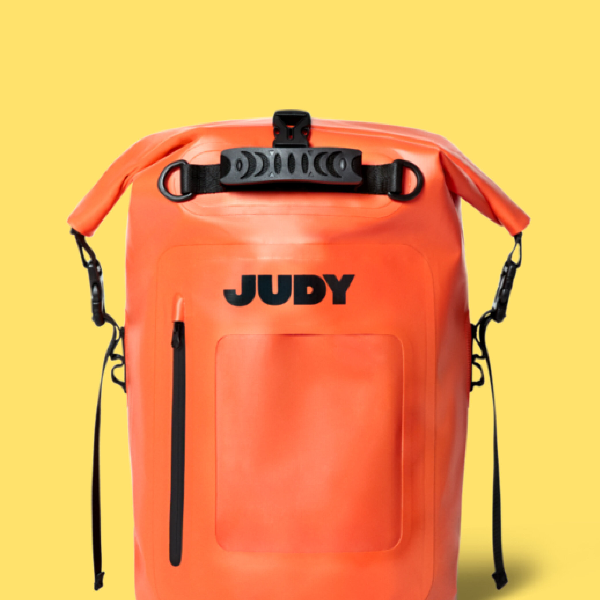
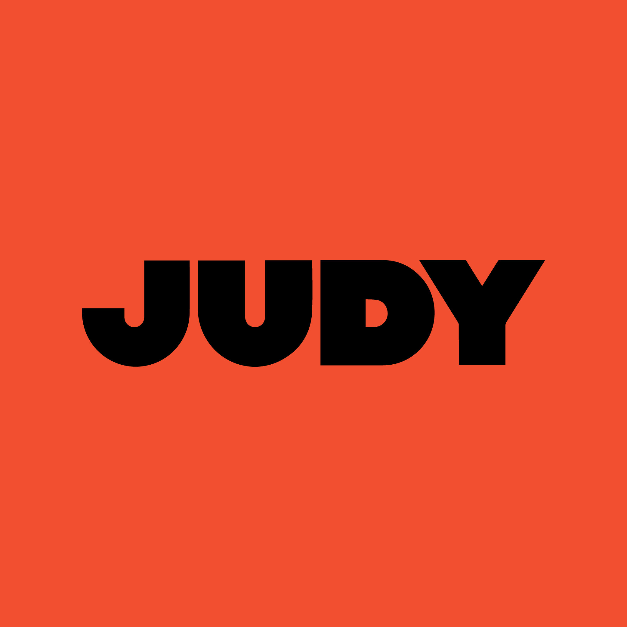
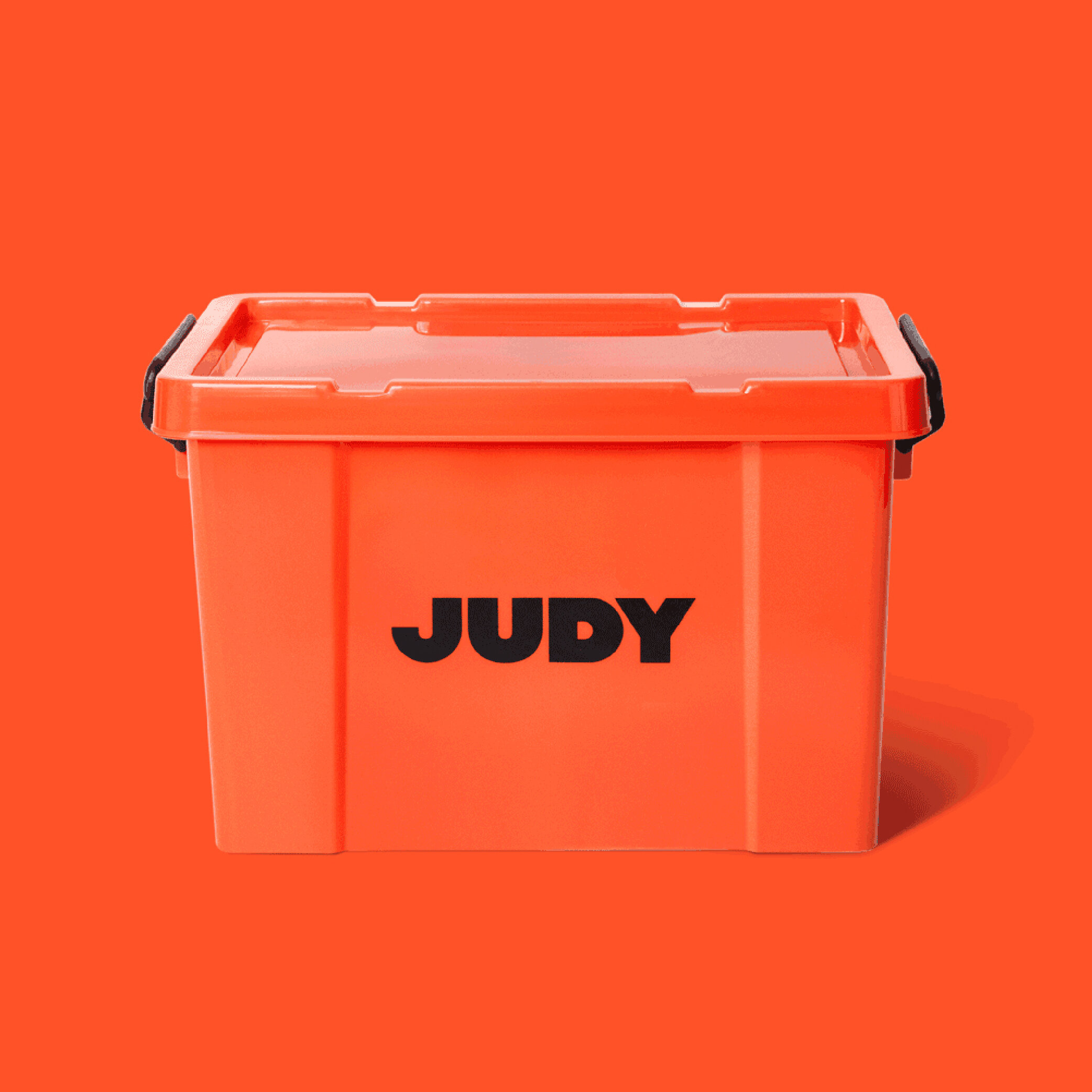
- JUDY -
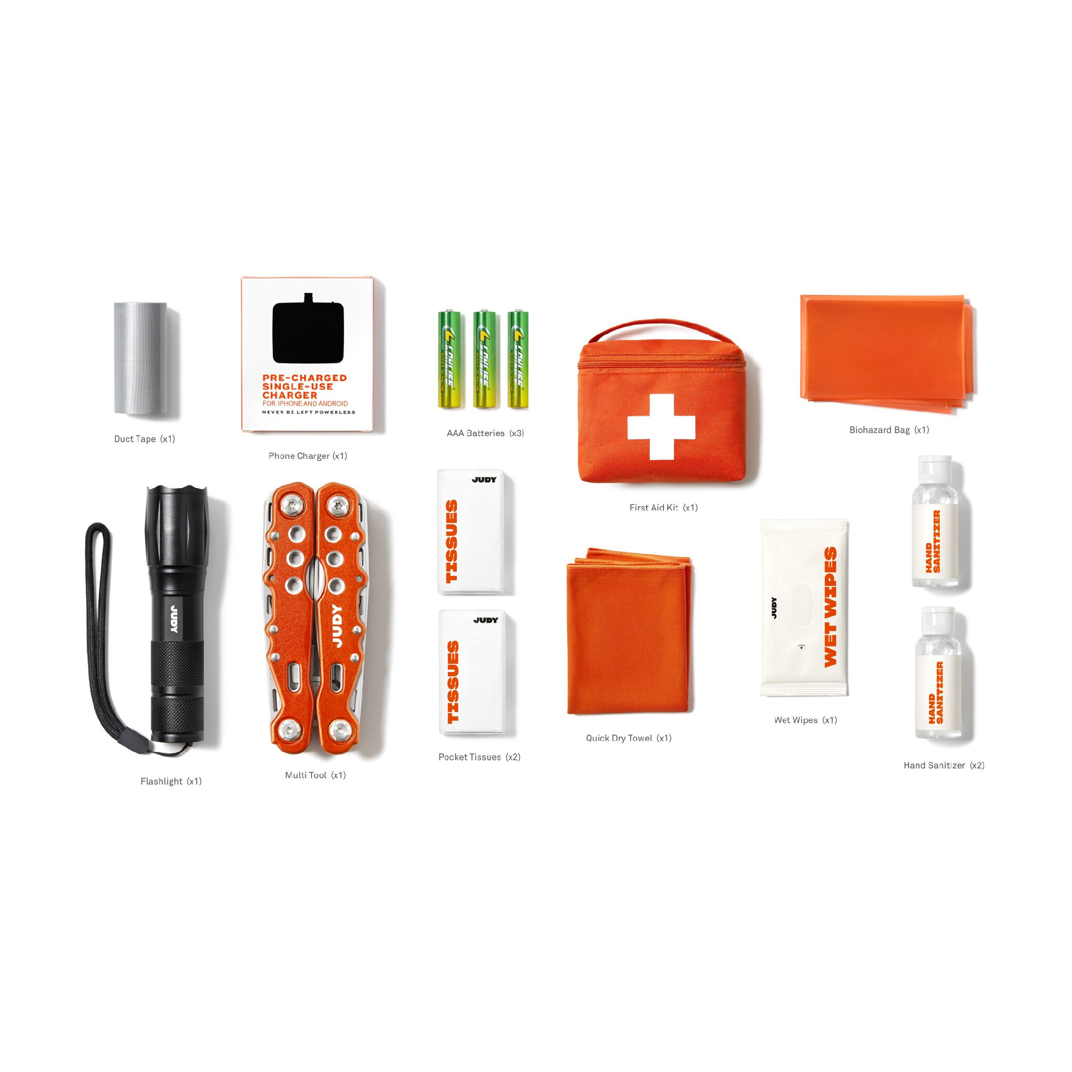
Some people may say it the end of the world, so today let chat emergency kit!
Judy creates "ready-Kit" in case of natural "or not" disasters. Red Antler NY-based studio has master the brand visual.
It's first and foremost VISIBLE and CLEAR; it will be hard to make it more punchy. The font is generous and attractive, as well as been able to be read from space.
The colour, well, is bold and recognisable.
J'aime.

- Love Wellness -
Sweet and sexy, the new branding design by Lobster Phone.
The typography play with the kiss and the heart is excellent without being too much. It's chicky and fun. The colour palette is well balance and contrasted . Excellent work.
💘 J'aime 💘


- Mantown -
Widarto Impact design agency based in Doha design the Koffie brand Mantown. This work is all about contrast. The primary and secondary fonts are from two worlds: one modern and tall, the other one classic and compact. The red and blue could not pop more together. The minimalist pattern highlights the sense of contrast. It's an exciting and clean work with its own storytelling.
https://www.behance.net/gallery/91241507/Branding-packaging-design-for-ManTown-Koffie


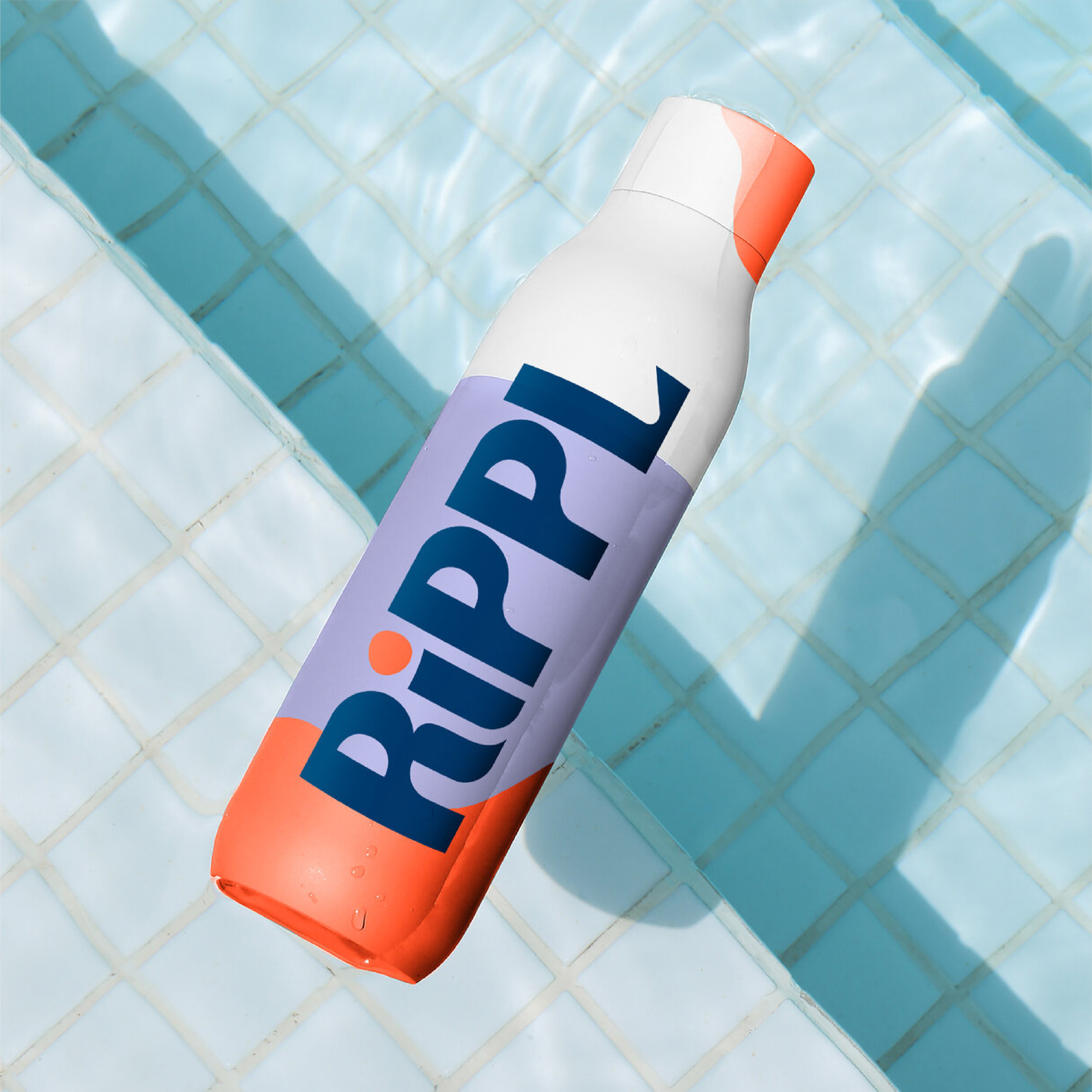
- Rippl -
This not the first time I mention Chris Stevens, today we talk about Rippl branding. The colour palette is fun and warm, I am not a big fan of the purple normally but this light tone working well with the pulse of the orange and the blue. The logo is the best part; it's a great balance between a classic font, and one more organic the imperfections of the curve give it all is strenth. Je suis en amour. Bravo
https://chrisstevens.me/rippl-retreat


- Tamanu -
Astrid Lajarrige French design has created a beautiful brand for Tamanu, a cosmetic product based on Tahiti's oil. It's clean and fresh. The font choice is excellent; it gives personality and quality to the brand. The use of the illustration brings honesty and trust as well as immersing us in Tahiti flavors. J'aime!
https://www.behance.net/gallery/90329849/Tamanu-Branding-packaging


